Filters
At the very top, you’ll find filters that let you customize how you want to visualize your analytics. You can adjust them to focus on specific time periods or audience segments.The Big Picture
This gives you an at-a-glance summary of your form’s performance. It includes:- Views – How many people visited your form.
- Starts – How many visitors actually started filling out your form.
- Submissions – Total submitted responses.
- Completion Rate – The percentage of users who started and submitted the form.
- Average Time to Complete – How long it takes on average for someone to finish the form.
- Views: 14
- Starts: 14
- Submissions: 14
- Completion Rate: 100%
- Avg. Time to Complete: 00:31

Total Submissions Over Time
The second chart shows submissions by day, giving you a clear view of how your form performs over time. This helps identify trends, spikes, or slow periods.Referrals
This section breaks down where your form traffic is coming from—such as Direct, Facebook, LinkedIn, X (Twitter), and more.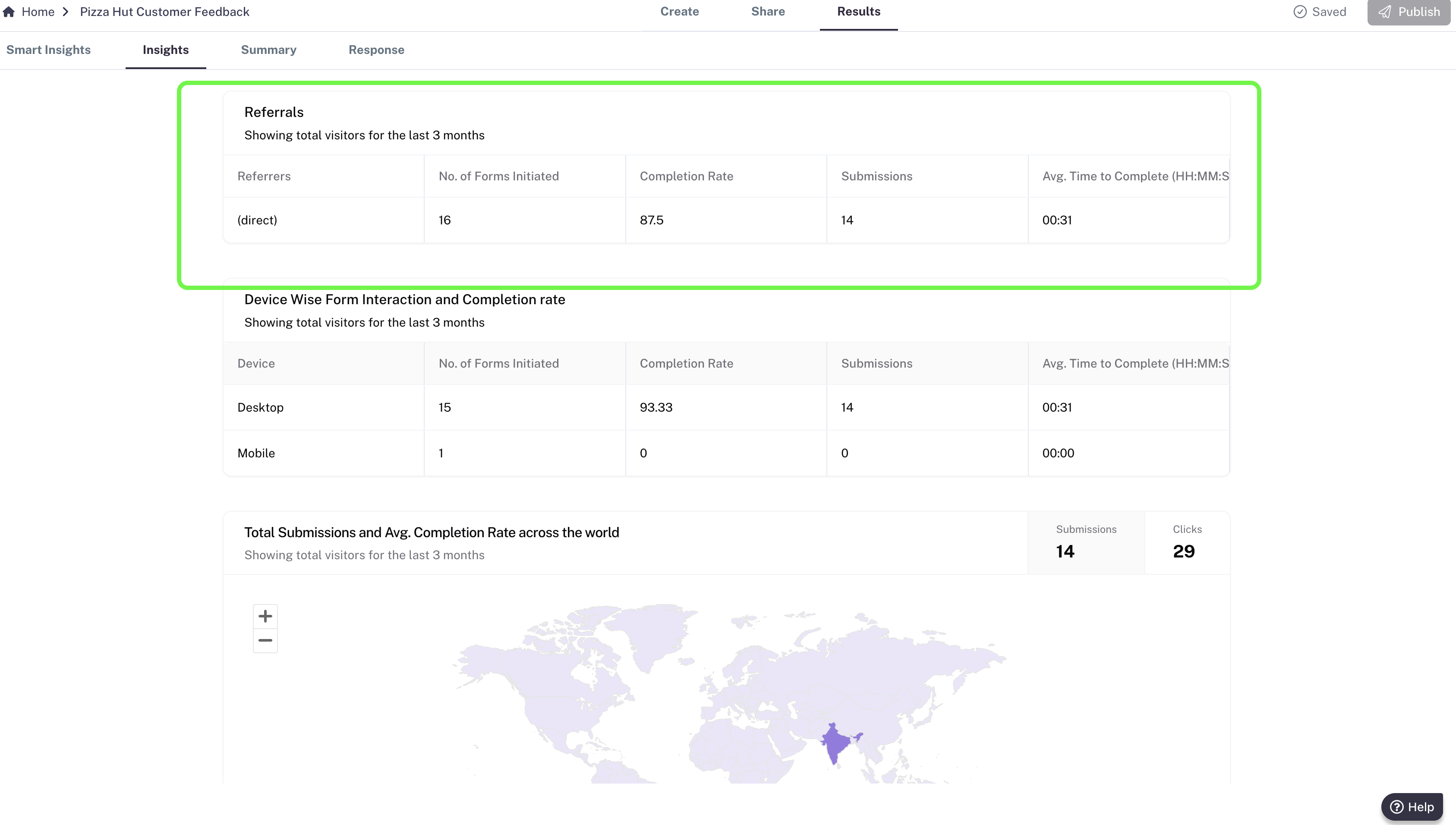
- No. of Forms Initiated
- Completion Rate
- Submissions
- Avg. Time to Complete
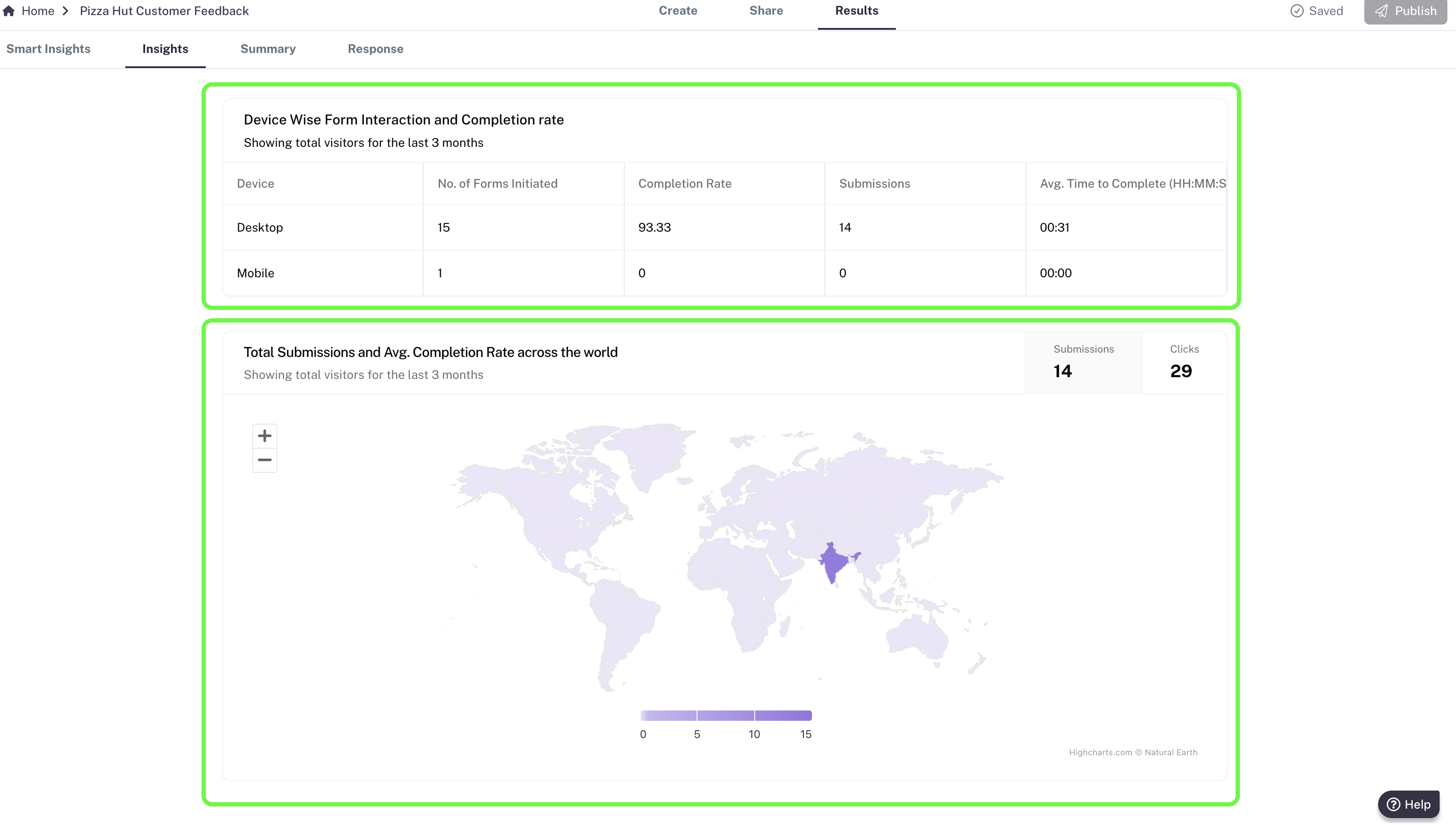
Device Insights
Understand how your audience interacts with your form across different devices: Desktop, Mobile, Tablet (iPad). For each device, you’ll see:- No. of Forms Initiated
- Completion Rate
- Submissions
- Avg. Time to Complete