More than half of form submissions today happen on mobile devices. The good news? All CaptureIQ forms are fully mobile-optimized by default.
Still, there are a few things you can do during creation to make sure your form is smooth and easy to complete on smaller screens.
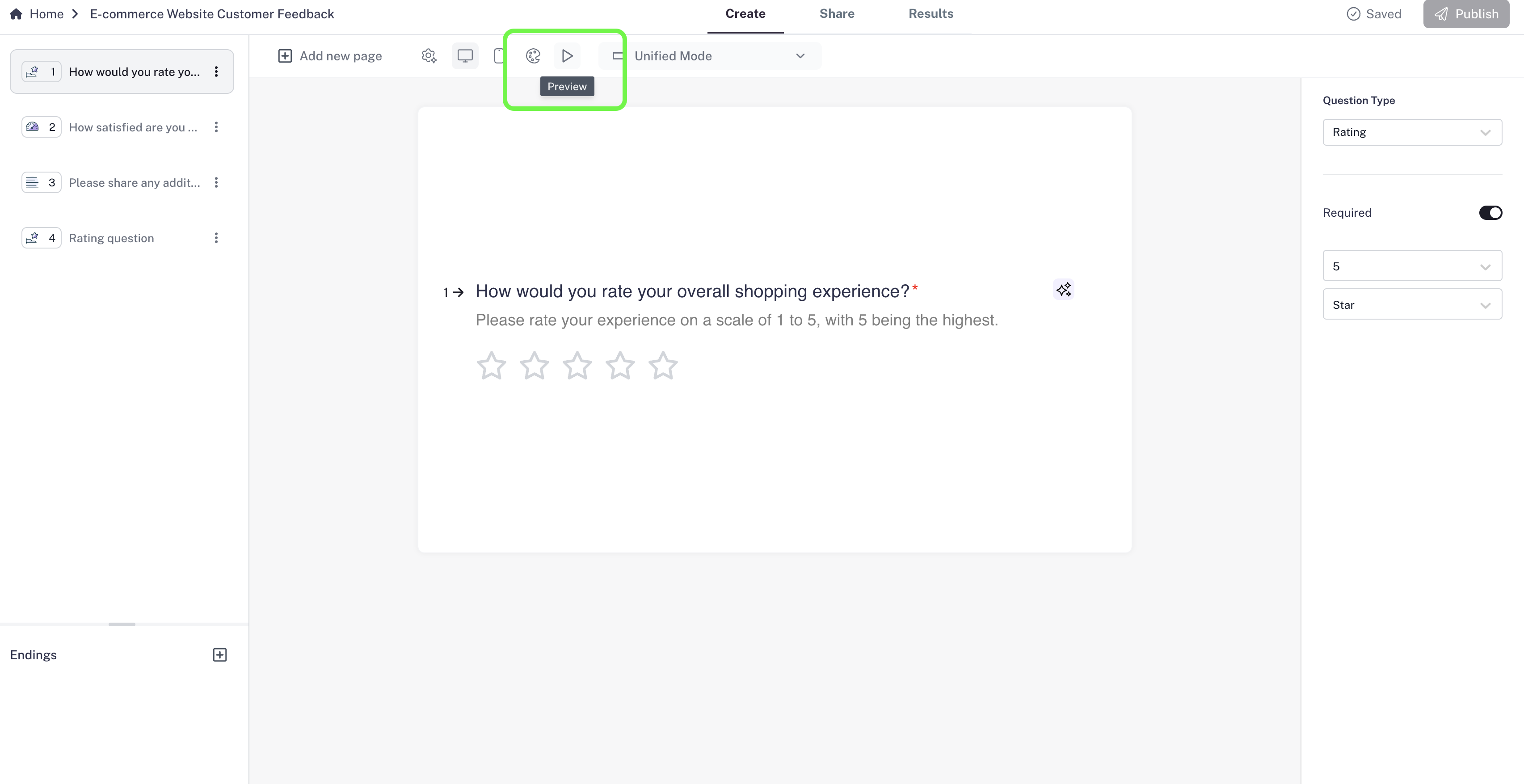
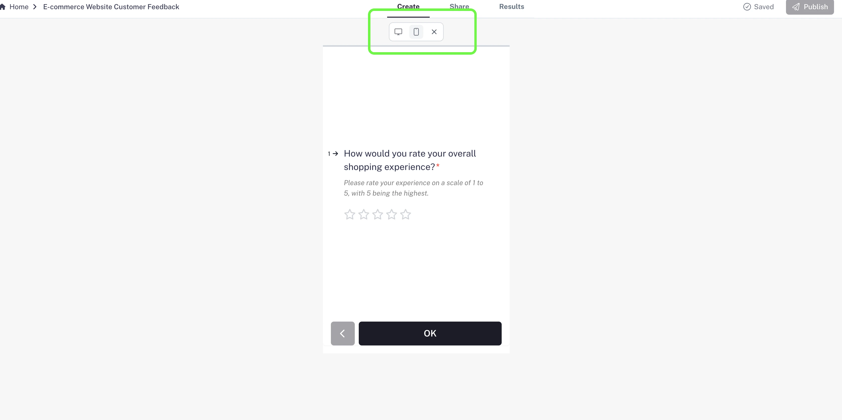
Step 1: Preview in Mobile View
- While creating your form, open the Preview.
- Switch to Mobile View to see exactly how it will look on a phone.
- This helps you adjust your content to make sure it’s not too crowded or text-heavy.
Step 2: Keep Questions Short & Clear
- Mobile users are often on the move, so keep your questions short and simple.
- Avoid long paragraphs or complex wording that might feel overwhelming on a small screen.
Step 3: Limit Answer Choices
- Too many options can make a mobile screen cluttered.
- For Multiple Choice or Dropdown questions, try to keep answer choices concise and limited.
- The goal: users shouldn’t need to scroll endlessly to see all options.
Step 4: Test Before Sharing
- Always test your form in Preview Mode on both desktop and mobile views.
- This lets you experience it exactly as your respondents will.
- Make adjustments if something feels too long or crowded.
Pro Tip: Shorter forms usually perform better on mobile. If your form is long,
consider breaking it into smaller sections or even separate forms.